Dots for Spots
Working closely with a cross-functional team, I developed and evolved the brand identity for the Dots for Spots US launch. My branding work was then implemented by a team of designers across Marketing and E-commerce platforms (including Amazon, the website, and social media platforms).
Deliverables
Brand Book (with new assets)
Product Listing Photos
PickFu tests
Amazon Plus Content
Storefront (Web Design)

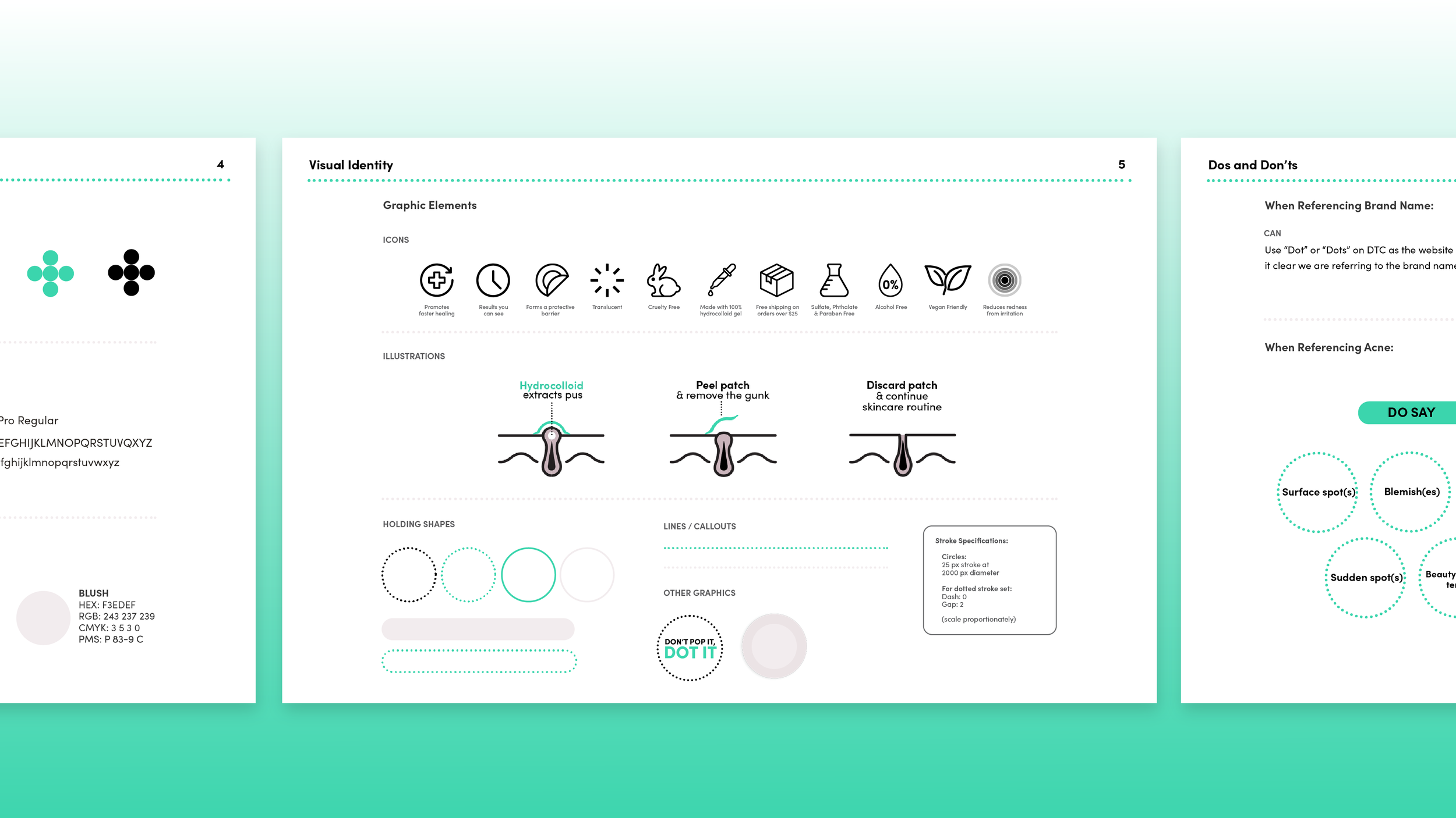
Brand Book (featuring new assets)
The Infographic
This three-part infographic was created to communicate to the consumer how the technology of the product actually works.
A simple, linear style was chosen to match the brand look and feel while separating Dots for Spots from competitors that use a more realistic/3D design style.
Using simple and familiar language was also key to making a more technical concept easy for the consumer to understand.
Product Listing Photos
Product Listing Photos
Product Listing Photos

Dots for Spots Launched as a #1 New Release in the US on Amazon.
Debuting at #9 in the subcategory, it quickly gained rank to #3 (within 24 hours) and has continued to hold that rank.
Beating the Competition.
Dots For Spots creative wins more than 2x the amount of votes against its top competitor, Mighty Patch.
After multiple rounds of creative development, I conducted a “PickFu” test of our top 6 photos against our competitor, Mighty Patch. The goal was to see if our new creative would be successful, while also gathering anonymous feedback from the survey participants to help us hone in on the finer details.

Storefront Pages


